Styling in React
May 2, 2020
This is an overview on how to apply styles through a basic react app created with the create-react-app
command
Opens in a new window  .
.
npx create-react-app <app-name>
Inline styles
For inline styles, the CSS properties are written in camel-case with their values in quotations. The properties are in the style attribute within double curly braces.
<p style={{color: 'red', textAlign: 'center'}}>This text will have inline styles.</p>
Classes
Import a stylesheet into the component file to have its declared classes available to elements. The element lists the classes within the attribute className instead of class.
/* App.css */

.Button {
  background-color: black;
  color: white;
  padding: 1rem;
  display: block;
  margin: 1rem auto;
}
// App.js

import './App.css';

// ...

<button className="Button">App Button</button>
Scoped styles
If you're coming from a Vue.js background, you would be familiar with "scoped-styles" which keep a component's styles separate from affecting other components.
All you need to do is create a <name>.module.css file to use scoped styles.
I created a Button component which uses the Button class created in Button.module.css.
Unlike the Button class created in App.css, this one has the background-color and text color switched.
/* Button.module.css */

.Button {
    background-color: white;
    color: black;
    padding: 1rem;
    display: block;
    margin: 1rem auto;
}
You need to name the import (here I used classes) to access the classes. Assign a class with classes.Button put in the className attribute.
// Button.js

import React, { Component } from 'react';

import classes from './Button.module.css';

class Button extends Component {
    render() {
        return (
            <button className={classes.Button}>Button with scoped styles</button>
        );
    }
}

export default Button;
classes is an object of all the classes in Button.module.css. In the console, classes looks like this:
{Button: "Button_Button__SRy8D"}
When rendered, the button will have the Button value as its class. The unique hash you see makes this class unique to this component so any other Button class won't clash styles with it.
You can see this when the <Button /> component is used in the App component.
// App.js

import React from 'react';
import './App.css';

import Button from './component/Button';

function App() {
  return (
    <div className="App">
      <button className="Button">App Button</button>
      <Button />
    </div>
  );
}

export default App;
Rendered to the page:
<button class="App_Button__1oc6-">App Button</button>

<button class="Button_Button__SRy8D">Button with scoped styles</button>
These unique class names keep the App and Button component's styles from affecting the other even though they have the same class name Button.
Tip
To append more than 1 class from a stylesheet, join them with the Array's join() method:
/* Button.module.css */

.Button {
    background-color: white;
    color: black;
    padding: 1rem;
    display: block;
    margin: 1rem auto;
}

.Purple {
    background-color: purple;
    color: white;
}
<button className={[classes.Button, classes.Purple].join(' ')}>Purple Button with scoped styles</button>
Rendered to the page:
<button class="Button_Button__SRy8D Button_Purple__2tiEH">Purple Button with scoped styles</button>
Here is a screenshot of the inline, classes, and scoped style examples:
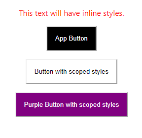 The text and 2 buttons styles in this post.